Why pick on Natick, MA?
I am resident and a homeowner in Natick NA and our family has been living here for the last 5 years . I use the Town’s website to pay a whole bunch taxes and fees - Real Estate Tax, Excise Tax, Water & Sewage Fee, and the occasional parking tickets (which hurts more than all of the rest put together, but I digress!) I am also active in the Citizen Committees and I frequent the Town website to access meeting minutes, agendas and any other public health/safety announcements.
Does a town website need to be a Kitchen Sink?
Natick’s website is a one-stop government portal for its 36,000+ residents. The Town is responsible for providing all kinds of pertinent information through its web portal even if most of the information may be of interest to a very small fraction of the population. Minimalism is not, nor should it be, the goal here. However, that doesn’t mean the portal should be heavily cluttered with all possible links. In addition, the website should allow for seamless online payment of fees, taxes, and fines. For the purpose of this exercise, I have solicited feedback from town residents through an online survey to confirm my own hypothesis about the functionality of the Town’s digital landscape.
First Impressions
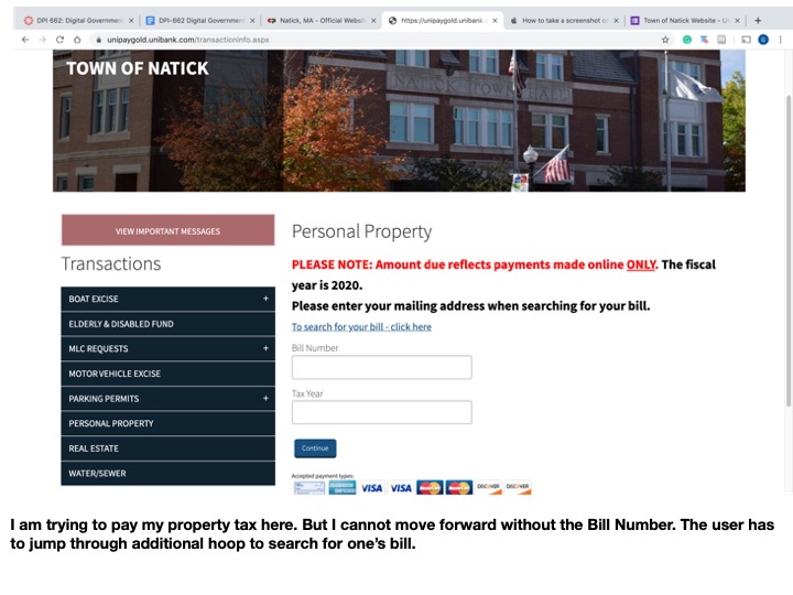
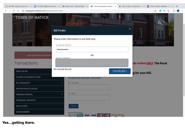
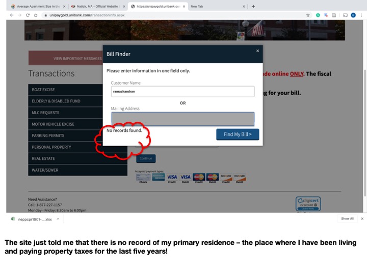
The town does not make it easy for you to give them money online!! There is no single landing page to pay for all the fees. Certain fees are redirected through separate third-party payment systems. Some of them accept only checks and do not accept credit card payments - when was the last time you memorized your bank routing number? The customer ID number for the water bill is different from the one for excise tax which is different from the ID number for property taxes. Disjointed systems put in place by different vendors at different times makes it extremely challenging to streamline the online payment process.
Anyone who has used Google will find the search function in the Town’s website completely useless. The town’s website is rich with pertinent information but the circuitous navigation that the user is subjected through does not help.
Hypothesis Testing, Resident Survey & User Feedback
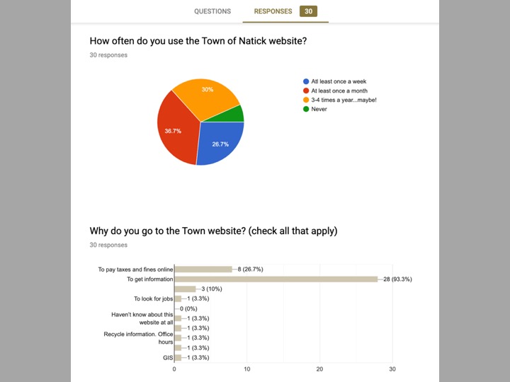
To test my hypothesis, I administered an online poll through Facebook and emails. I solicited responses from 3 groups - Natick Dads, Natick Town Meeting Members, Natick Desis (South Asians), and board members of Natick Affordable Housing Trust Fund. The survey asked about how frequently the user visits the website, the purpose of the visit, the most useful things one finds, the most useful and frustrating aspects of the websites. The results are shown below based on 32 user responses.
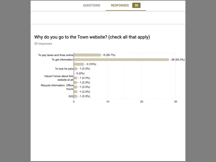
About 25% of respondents visit the site at least once a year and around 40% of survey respondents visit the Town website at least once a month. Over 93% of the respondents are using the site to access information and 30% of users use the site to pay taxes, fees, and fines.
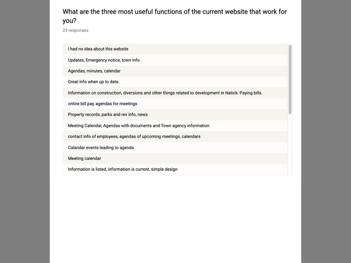
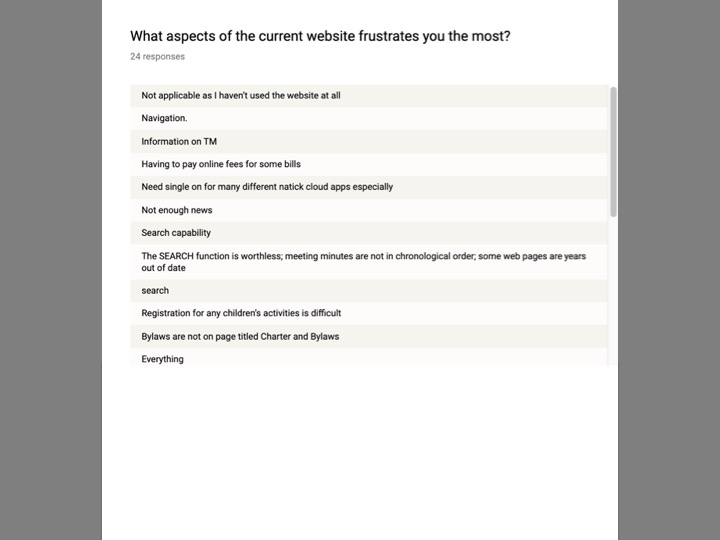
The information that is being sought more often is meeting minutes and agenda, information on paying bills, town announcements (alerts, traffic diversions, etc), Property records/GIS. When asked what aspect of the website frustrates users the most, the lack of useful search function and difficult navigation features the most. It was an open-ended question and responded gave similar answers in so many different ways.
Online Path to Pay Town Taxes
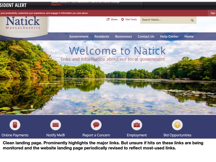
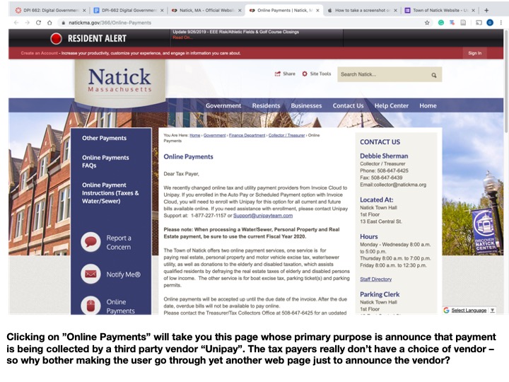
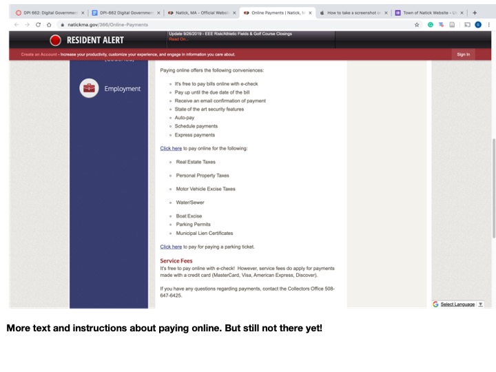
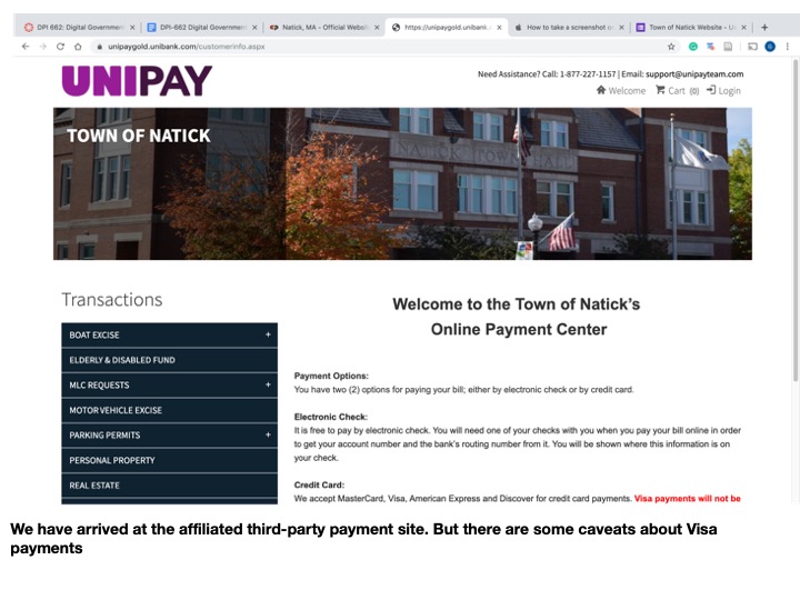
Recommendations to improve online payment system
Create a single-authentication user-id for town residents and property owners
Redesign tax bills to clearly identify user-ids. Suffixes to bill number may be used to identify the type of bill.
Create a single page for all online payments by residents (Property Tax, Water & Sewage Bill, Motor Excise Tax, Business Tax, Parking Fines, Other Fines)
Seamlessly integrate the third-party payment system within the Town website
Recommendations to improve content organization and site navigation.
When asked what aspect of the website frustrates users the most, the lack of useful search function and difficult navigation rose to top of the list. It was an open ended question and respondents gave similar answers in so many different ways —
“search function is worthless”
“need too many clicks to drill down information”
“hard to find what I am looking for - no contact information for board members”
“everything”
I would recommend doing a traffic diagnostic analysis of the website to identify most visited pages, broken links, and the pages where users give up seeking information without completing the task - that for which they came to the site in the first place. And completely rethinking the navigation to be in sync with the user demands.
It’s time to rethink the navigation and make the search function more robust. Older websites and digital town portals should not last forever with multiple corrective patches, especially when they are supposed to function as effective Kitchen Sinks.
